Launch win Best Print Design of 2022
Launch have been named a winner of the Best Print Designs of 2021 by DesignRush for the Scottish Chambers of Commerce print designs.
Scottish Chambers of Commerce (SCC), the umbrella organisation for 21 local Chambers of Commerce, has built a reputation as Scotland’s premier voice for business at both national and international levels. SCC promotes the interests of their member companies and helps them rise to the challenges, seizing opportunities and succeeding in the ever-growing marketplace.
With this idea, SCC approached Launch Digital, an agency specialising in all things marketing, to deliver the materials for the organization’s two biggest trips, as well as the Global Business Dinner. This includes leaflets, posters, banners, business cards, exhibition stands, booklets and brochures.
Launch presented a thorough design that balances SCC’s distinctive corporate identity and its extensive information-heavy content with a touch of luxury and adventure to communicate the key aspect of the industry.
The starting point for this design was taking the audience’s understanding of Scotland’s financial overview and delivering a product that is unambiguous and visually inviting, even for readers who may not be familiar with the rather niche topic.
Scottish Chambers Print Design Bridges Two Hemispheres Effortlessly
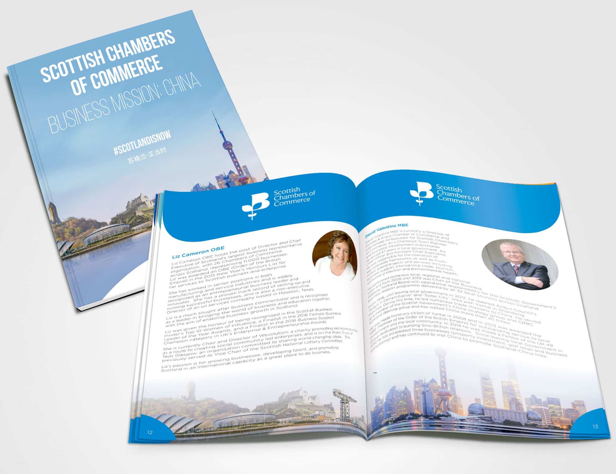
The multipage booklets reveal the organisation’s identity with a striking, contrasting design that depending on the event, utilises a distinctive colour scheme catering to a specific audience.
For example, the Global Business Dinner print design sports a garish red cover that honours the esteemed guest, his Excellency Liu Xiaoming, Ambassador of the People’s Republic of China.
On the other hand, the majority of print designs utilise the blue-white colour combination. In such a case, prevalent whiteness isn’t only used as a negative space that accentuates the content. It is in fact, one of the defining colours of Scotland’s national flag.
The typography is easy on the eye and makes reading a pleasurable experience, while the combination of premium printing technology and a geography-bridging colour palette conveys the feeling of an organisation that is at the top of its game as a respected industry leader.
The selected typeface adds a deeper level of clarity and forms a content breakdown that is easy to comprehend.
Launch also worked with language interpreters on the Chinese material to ensure that the translation was accurate and utilised image manipulation to seamlessly merge Scotland with China.
Scottish Chambers Print Design Demonstrates Commanding Consistency Across Different Media
Aside from various iterations of Scottish Chambers print design, Launch also created a billboard and banners that spell out the main marketing message, cleverly emphasising the “NOW” part of the CTA.
The unified Scottish-Chinese landscape, complemented by the white semi-circle transforms the whole scene into a robust bridge. The minimalistic circular highlights that dominate these designs serve a couple of functions:
- From a psychological point of view, circles represent the notions of unity, integration, wholeness and they give on-lookers a sense of completion, confidence and harmony.
- Derived from SCC’s logo design, they focus the viewers’ collective attention on the organisation itself
Scottish Chambers’s Brochure Manifests Modernity and Organisation’s Multinational Mission
As Scotland’s largest and most influential business-to-business network of more than 12,000 companies and over 50% of the country’s private sector workforce, SCC takes special pride in its multinational vocation and culture. This was the driving force behind the brochure’s mission-focused look that goes well beyond this niche’s comfort zone.
The rather minimalistic cover boasts the Scottish Chambers of Commerce logo in a classy white, semi sans-serif Beaufort font against a glossy blue background. The stylish circles around it are not a simple artistic choice, but a graphical representation of SCC’s global focus.
The inside of the publication features occasional hi-res visuals, infographics and other depictions of financial figures that break the content and make it more digestible.
The whole package projects the feel of modern design and presents the SCC as the organisation that looks ahead.
Scottish Chambers Print Design Marks the Triumph of Corporate Branding That Knows No Boundaries
Reliant on a very strict colour scheme and limited design elements, the final design that communicates professionalism and efficiency is the set of bilingual business cards.
As a great asset to the organisation’s branding, they are a natural extension of the SCC’s promotional efforts.
When creating SCC’s business cards, Launch opted for a simple and clean design that gives the impression of “everything in its’ place” and the idea that Scottish Chambers knows precisely what it’s doing.
Just by glancing at them, prospective associates can safely assume a smooth, easy and transparent partnership experience with the organisation.
The “less is more” approach lends space for variation. The sheer number of different application options makes Scottish Chambers print design worthy of DesignRush’s Best Design award for February 2022!